Our research -
Before making our distribution company video, we researched several real-life distribution companies; here are some examples of the companies, and what we learned from their videos:
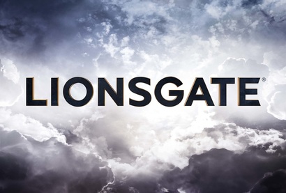
This the distribution company logo for LionsGate UK. The black and gold text is bold, and stands out against the near-white clouds. These colours, are regal and powerful and the name 'LionsGate' can be broken down into the Lion, representing power, and the Gate, showing the accessibility of their films.
We have incorporated aspects of this logo in our own, such as the use of colour to provide connotations. In our own logo, Firestorm Films, we used the colours of bright red and a mellow blue; the red showing power, while the blue provides a contrast, the calm of the rain.
We have incorporated aspects of this logo in our own, such as the use of colour to provide connotations. In our own logo, Firestorm Films, we used the colours of bright red and a mellow blue; the red showing power, while the blue provides a contrast, the calm of the rain.
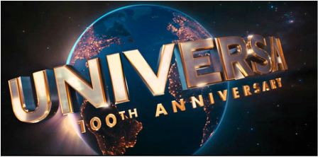
Universal is one of the most famous distribution companies, and its logo is recognised world wide. Its use of colour and image invokes a sense of grandeur and luxury. The image of the world shows that the film will be distributed across the globe, and the lights in all of the nations, are symbolic of people of all nationalities watching their films.
We have also tried to make our distribution logo as bright and vibrant as possible, in order to stand out and catch the viewers eye.
We have also tried to make our distribution logo as bright and vibrant as possible, in order to stand out and catch the viewers eye.
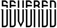
Our Distribution Company Logo
After researching the distribution companies, we made our own video; naming our company Firestorm Films. We chose this name as it carries weight, showing how powerful, significant and influential our company is - a metaphor for how we would distribute our films, like an unstoppable storm. We incorporated aspects of famous distribution companies, for example, we have used elemental features, such as the fire and the rain. Elemental features such as clouds are used in production companies such as LionsGate, to represent how their films affect the whole world.
We used a colour scheme of red and blue, using darker shades of red in the foreground, and a darker shade of blue in the background; in order to contrast the bright blue in the foreground and bright red in the background. This use of aesthetic appeals to the eye and stands out, much like the universal logo.
We also used a slow pace, to reflect the calmness of the rain and also the calm nature of other production company logos, such as Universal.
